The purpose of this UX case study is to walk through the design
of a travel app that helps travelers plan group trips easily and
asynchronously. In today’s world, people are traveling more
than ever, and group travel has become increasingly popular.
However, planning a group trip can be a daunting task,
especially when everyone has different schedules and
preferences.
Travel planning is overwhelming for many people; especially those that have jobs, children, and/or friends and family that do not live nearby. There are a multitude of aspects that must be accounted for when planning a trip ranging from transportation, accommodation, excursions, and everything in between. Currently, tips and booking resources are spread out on a plethora of different websites and applications. More than one quarter of seasoned travelers used travel agents before the pandemic, and that number is expected to rise to 44% in the upcoming years. Travel agents are inaccessible to people from lower socio-economic classes, and are not popular among younger audiences. With such a wide problem space, I aimed to design a product that improved the travel planning experience by narrowing in on the specific challenges of group trips.
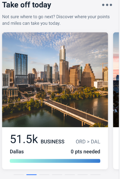
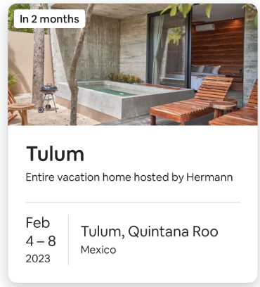
As an initial competitive analysis, I researched several travel apps that offer group trip planning features such as Airbnb, TripIt, and Travefy. I found that most of these apps offer similar features such as trip itinerary management, shared calendars, and expense tracking. However, none of the apps offer asynchronous communication features that allow users to discuss trip details at their convenience based on specific interests and suggestions. I also found that most travel apps were designed for solo travelers or couples, and did not cater to the needs of group travelers. This gave me a unique opportunity to design an app that addresses this issue and makes group trip planning more efficient and enjoyable.

help group travelers easily collaborate to organize trips so that each individual has equal input in the planning process?
1) Every participant in a group trip does not necessarily have a role in the planning process
2) Different people have varying ideas of what constitutes the “perfect” vacation
3) Some people prefer to have a packed schedule, while others do not
4) It may be hard to reach a consensus on what activities to partake in
5) People have varying budgets for travel
I believe that the responsibility of planning a group vacation is primarily a role taken on by one person. I will know this is true when I survey the involvement in the preparation process of individuals who have traveled with others.
In order to confirm or refute my assumptions and hypothesis, I recruited 5 individuals to ask the below questions that met the following criteria:
1) Participant has traveled in group setting
2) Participant is a frequent international traveler {>3 x a year}
3) Participant does not use Travel Agent services

The following quotes give insight into the core needs of participants on a group trip
"Dealing with other people's personalities and interests on a trip can be difficult."

"Let me know how much everything costs and I will CashApp you."

"My past pain points have been when people have bailed out at the last minute or been flaky travel partners."
Interviewee’s tend to leave travel planning to other friends and/or family members in the group. There is too much involved in the organization process, so they trust that somebody else will handle the “dirty work”.
Overall, travelers want somebody else to take care of trip logistics. It is easier to contribute money than time.
While the overarching goal was to create a product that allows users to easily plan trips with friends and family by connecting over an app, this was a very broad endpoint. I broke this down into a few smaller, more manageable needs to tackle, based off the secondary research and user interviews.
Create a user friendly interface that simplifies the travel planning process
Help users discover new destinations and activities
Foster collaboration and communication among group travelers

I initially decided to focus on designing the workflow for a primary task that is critical to the app's success: enabling group travelers to create and organize travel itineraries
I designed my primary task flow of creating a new trip plan from the perspective of Wendy Collins, a 32-year old IT specialist who is seeking to go on vacation with a group of friends from college with varying interests and minimal time to devote to planning a trip.
.png)
The "happy path" task flow for the selected workflow which includes:
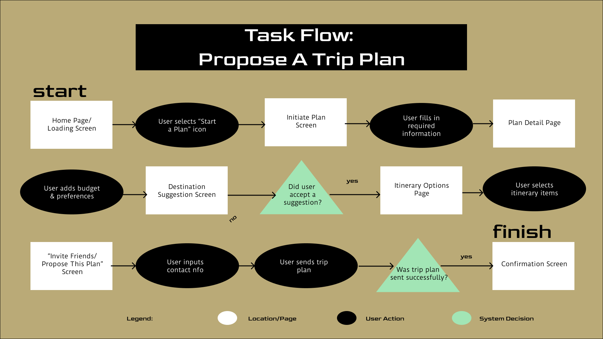
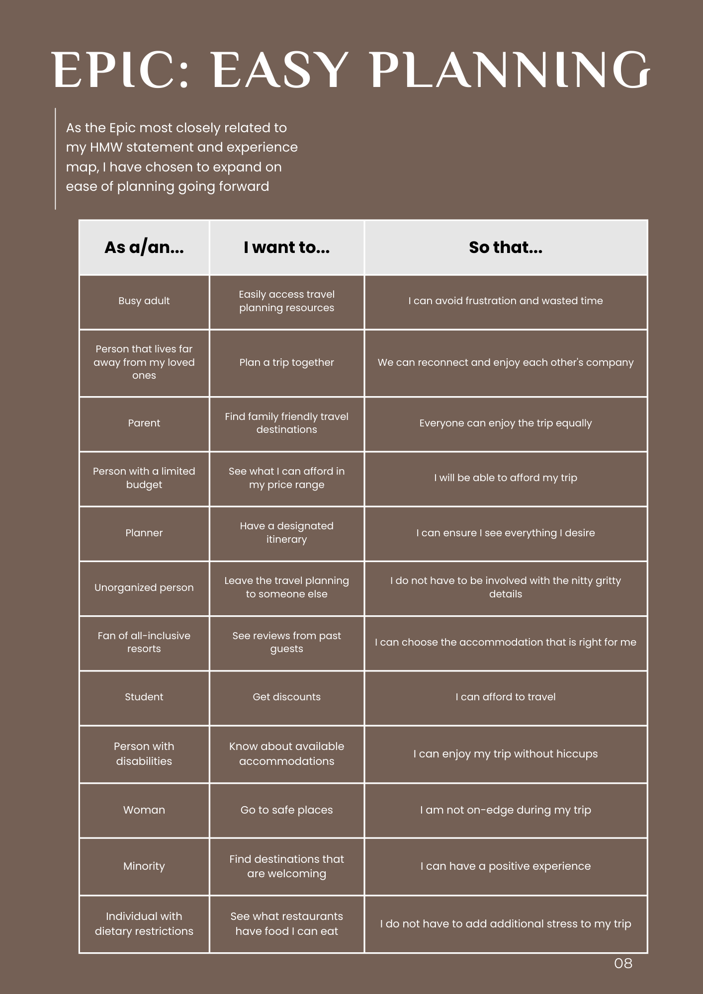
After authoring ~30 user stories from the perspective of varying individuals you may find engaging in group travel experiences, I sorted them into three categories; earning $$$, easy planning, and new experiences. I found "easy planning" the most robust of the three, and moved forward creating a task flow diagram.
I drew inspiration from existing travel apps and other collaborative platforms. I also used the research insights from the conducted competitive analysis and identified opportunities for differentiation
Taking inspiration from my UI board, I began the preliminary sketches that explored interface design options to meet the core needs of my target audience.
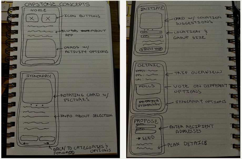
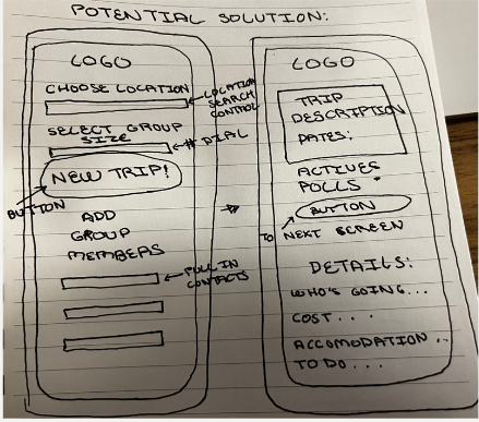
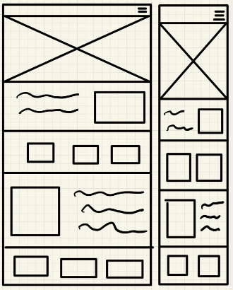
Using my UI Inspiration Board and an assortment of exploration sketches, I began to create mid-fidelity wireframes to be used to create an initial prototype for subsequent user testing. Below, I have defined the typographic and grayscale conventions I followed. The wireframes were made for an iPhone 14 and used a 5 column layout grid design system with 10 pixel margins.
Prototype one consisted of low-fi to mid-fi wireframes that would be used for subsequent usability testing
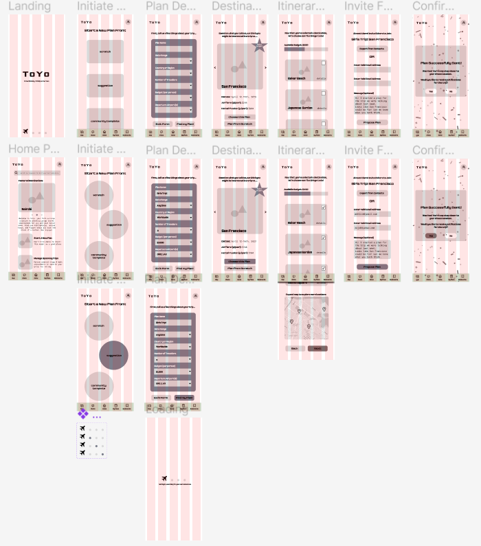
After stitching together my wireframes into an initial prototype I began the recruitment process for my first round of user testing. I selected individuals from varying demographic backgrounds that have all participated in group travel experiences on multiple occasions. The overall task was completed by all participants, but there were a few minor usability areas of concern that could be improved.
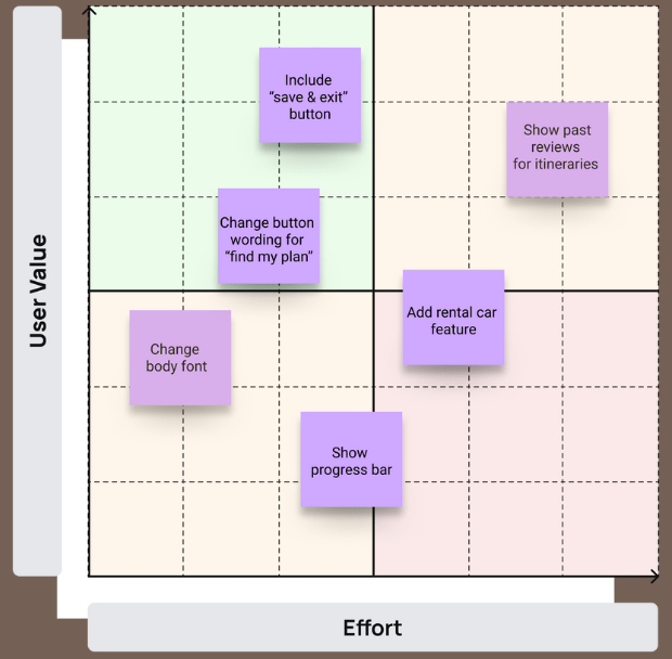
After analyzing the feedback I received after round one of user testing, I organized all of the comments that did not revolve around mockup fidelity limitations {i.e. "infuse color", "add pictures" etc.} onto a design prioritization matrix that allowed for me to visualize where the greatest opportunities for optimization within a limited time frame were. In response to the feedback that I received from the first round of user testing and changes made based on the prioritization matrix, a few adjustments were made before round two of usability testing and the finishing touches on my high fidelity prototype.
After making adjustments to the initial prototype, I began testing with additional users. I found that while the minor changes in the revised prototype did improve overall usability, there are still several enhancements that can be made in future iterations.
Some of the most constructive feedback included:
~ "Add an itinerary feature, so that you can put the activities into certain time slots"
~ "Add categories and filters for different vibes"
~ "Make 'save for later' button a bookmark"
~ "I want to be able to break down the budget by person"
~ "Make photo cards full bleed on the screen"
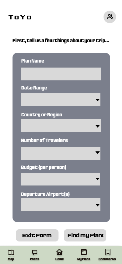
To the right is a side-by-side comparison of the Plan Detail Page before and after implementing suggested changes such as a progress bar and string clarification.
.png)


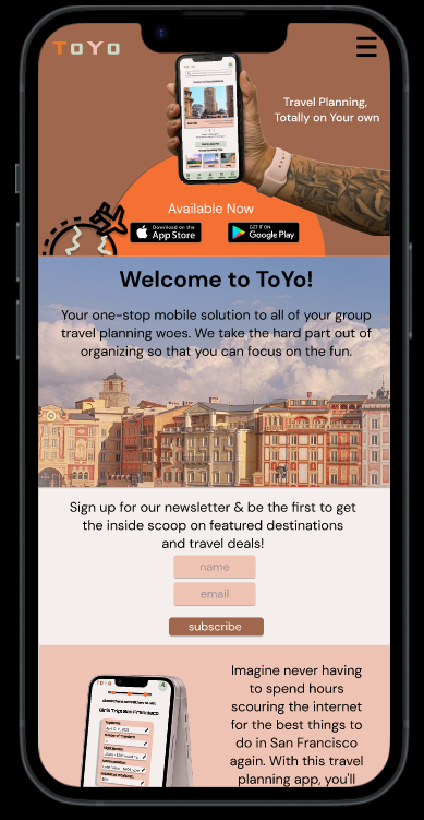
The look and feel for my product came largely from the playful and anticipatory nature of travel itself. I wanted to create a product that made travelers feel supported and inspired as they embarked on the adventure of planning their next trip.
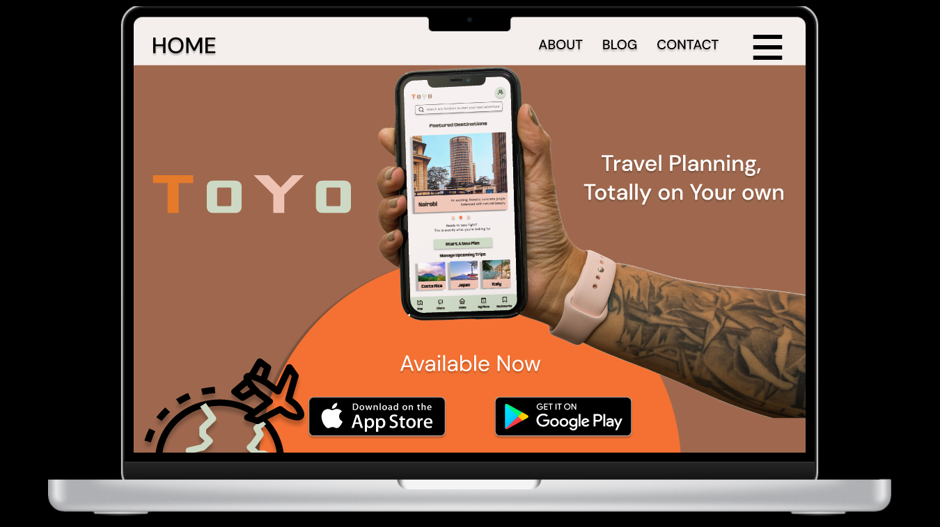
After creating my A/B list and reviewing some of the ideation work that previously led me to my brand name, ToYo and slogan "travel planning, totally on your own", I began to assemble a mood board that reflected the aspirational values of my product.
I began constructing my UI library based off the colors in my logo, and went from there to break down the elements of my application to be used in future workflows and by other designers if necessary
%20(1).jpg)
%20(1).jpg)
%20(1).jpg)
%20(1).jpg)
%20(1).jpg)
%20(1).jpg)
%20(1).jpg)
%20(1).jpg)
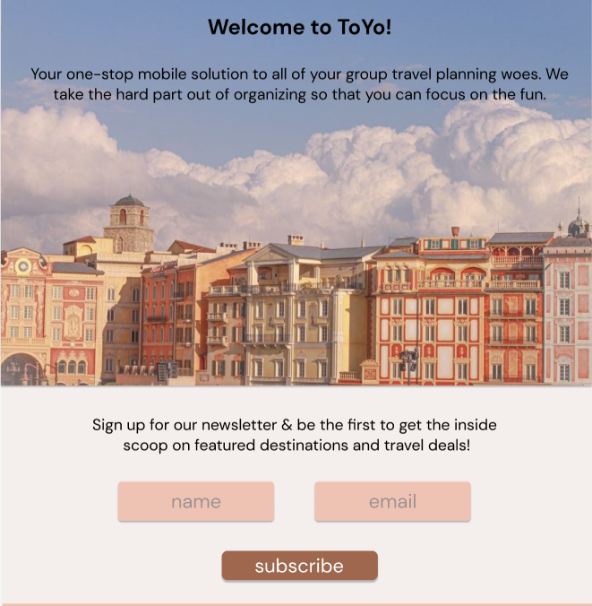
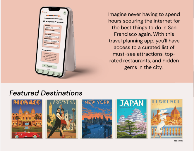
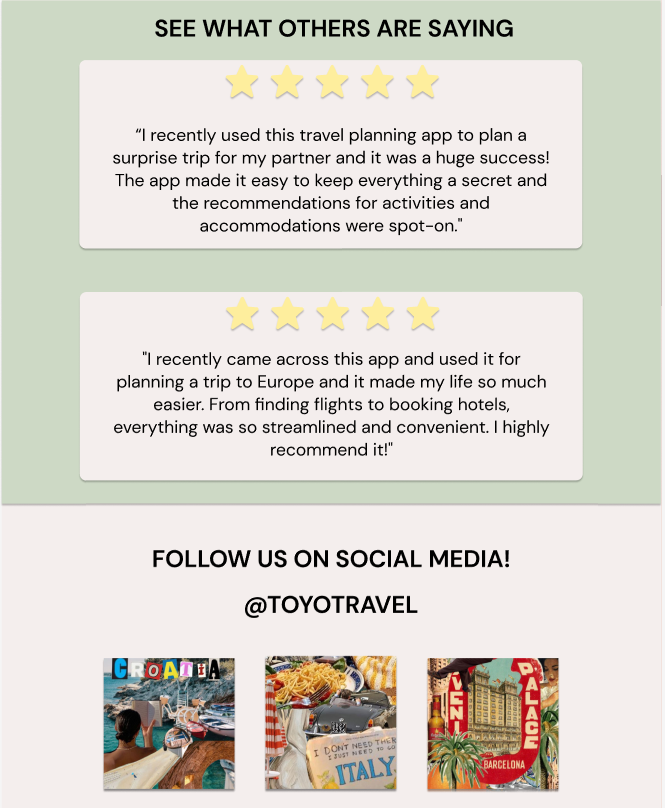
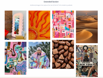
When first defining the visual identity of my marketing website, I wanted it to capture the essence of what ToYo as a brand really stands for. Traveling should be fun, adventurous, and afford new experiences. Coupled with the app's playful UI, I selected bold art-pop style images that evoke feelings of whimsy and maximalism.
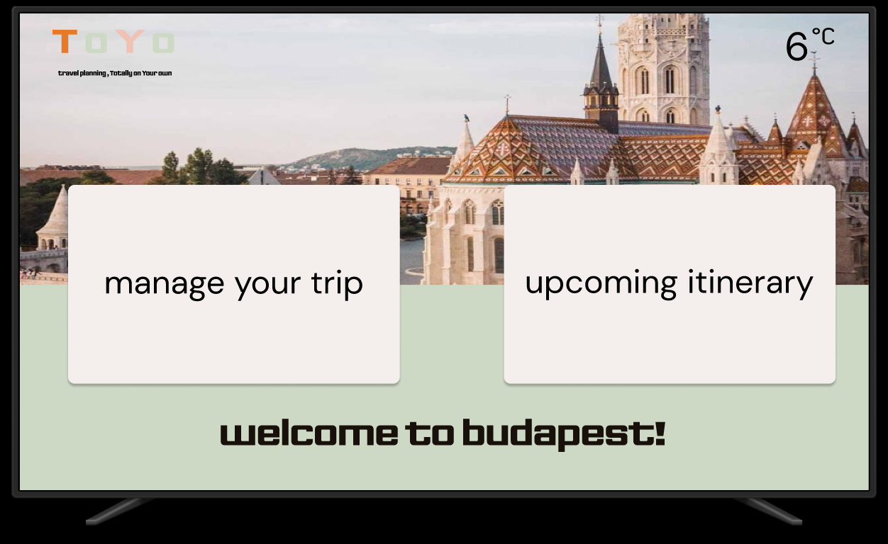
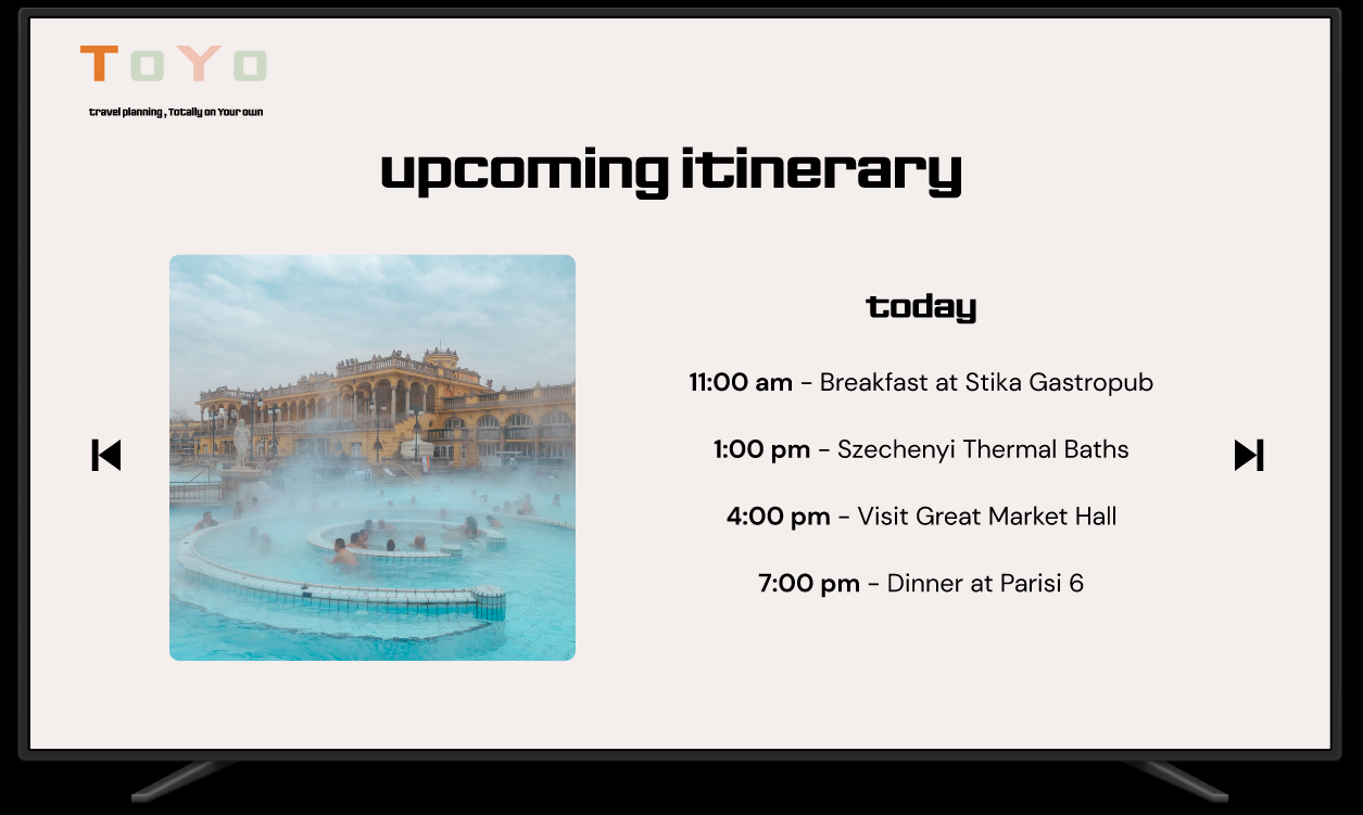
When considering how ToYo could expand to other markets, I ended up reimaging how users could manage existing trips while they are actively traveling and decided that the TV would be an ideal platform for this as it fosters a community aspect while gathering around a {temporary} living space.

ToYo has the potential to have a significant design impact by improving the overall group travel experience. By providing an intuitive and user-friendly interface, the app simplifies the travel planning process and makes it easier for group travelers to coordinate and collaborate with their companions. The app can also enable users to discover new destinations and attractions that they may not have otherwise considered, enhancing the overall trip experience. Additionally, by fostering communication and collaboration among group travelers, ToYo can help prevent common challenges such as conflicting schedules and disagreements over itinerary and activities. Ultimately, a well-designed travel planning app for group trips has the potential to make group travel more enjoyable and accessible for all.
This project helped me learn the importance of user-centered design, collaboration, and iteration. While diving into the world of product testing and accessibility, I discovered the challenges of designing for group travelers and the opportunities for differentiation in the travel app market. In current and future projects, I can utilize the knowledge and lessons learned throughout capstone to better anticipate what the needs are for core users and not be afraid to shift course from my preconceptions of the problem space.
%402x.svg)